Table of Contents Show
By Perla Irish — Home Decor Writer at DreamlandsDesign
Last updated: September 15, 2025
Minimalism doesn’t mean empty walls—it means giving the right piece room to breathe. When the art, the negative space, and the furniture read as one composition, the whole room calms down. Below is a clear, practical guide to choosing and placing minimalist art—plus ten ideas you can actually use today. We’ll also cover sizing, height, spacing, frames, and a short FAQ so your walls look quietly intentional (not stark). For broader style context, see AD’s primer on minimalist interior design.
How to Place Minimalist Art (Quick Rules)
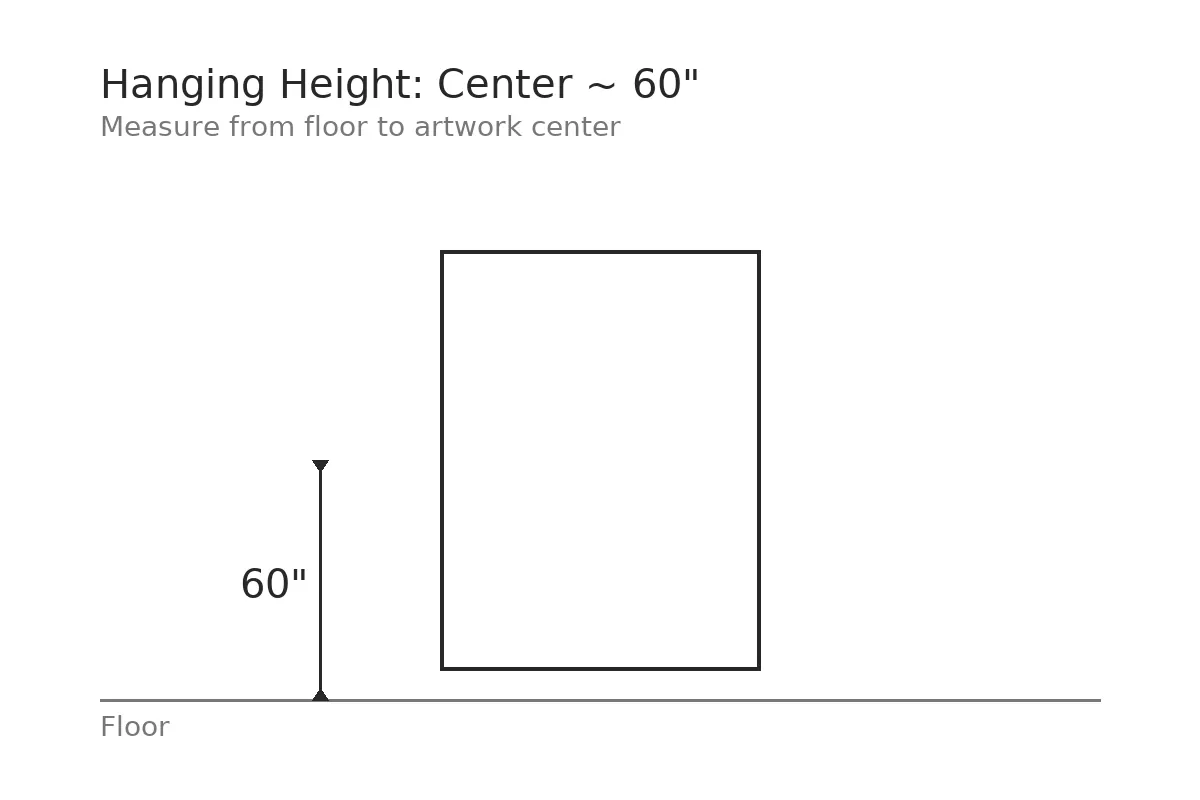
- Height: Hang the center of the piece around eye level—designers commonly start at 57″ (some push toward ~60″ in taller spaces). See Apartment Therapy’s 57″ rule.
- Over furniture: Keep the bottom edge 6–8″ above the sofa/console so the art and furniture feel like one visual unit. Designer guidance: Emily Henderson’s hanging guide.
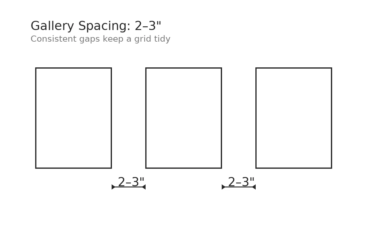
- Spacing: 2–3″ between frames (use 1–2″ in tight spaces) so a grouping reads as a single composition. A concise rule-of-thumb: Mansion Global’s gallery-wall rules.
- Width: Aim for ½–⅔ the width of the furniture it sits above—large enough to feel anchored, not floating. Explained here by The DIY Playbook.
1) Abstract Geometric Shapes
Pure shape, limited palette. One graphic canvas above a sofa anchors the room without visual noise. If your sofa is 84″ wide, a geometric canvas in the 42–56″ range will feel connected—not floating.
Pro tip: If you’re between sizes, go a hair bigger. Oversized reads deliberate; too small looks accidental.
2) Monochrome Photography
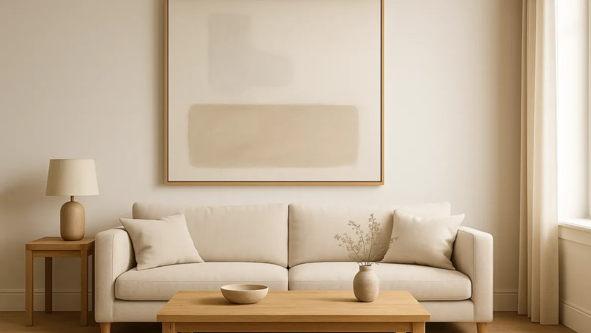
Black-and-white prints are minimalist workhorses—quiet, moody, and timeless. Hang the center near eye level (start around 57″, adjust to the room), or, if it’s over a console, keep the bottom edge ~6–8″ above the surface so the two read as a set.
Pro tip: Use thin black or natural-oak frames with white mats to keep the lines crisp.
3) Minimalist Line Drawings
A single continuous line on heavy paper gives all the calm with none of the clutter. Keep the mat generous; it creates breathing room.
Pro tip: In small spaces, hang pairs 1–2″ apart so they read as one.
4) Muted Landscape Paintings
Soft horizons, low contrast, and big negative space. Landscapes don’t have to be busy—think foggy shoreline or desert dusk.
Pro tip: If the wall catches harsh afternoon light, swap glass for non-glare acrylic to reduce reflections (your neutrals will photograph better, too).
5) Color-Field Canvases
One field of color > ten small prints. A single, oversized color block creates a calm focal point and cleans up the composition.
Pro tip: Over a long sofa, consider one color-field canvas sized ½–⅔ the sofa width to avoid that “floating postage stamp” look.
6) Minimalist Nature Prints
Botanicals, grasses, stone textures—organic forms bring softness to a strict palette. From minimalistic nature theme prints to abstract leaf silhouettes, nature motifs keep minimalist rooms from feeling sterile.
Pro tip: Hang pairs 2–3″ apart in living rooms; go 1–2″ in narrow halls so the grouping stays cohesive.
7) Text-Based Art
One word. One short line. That’s it. The negative space is the message.
Pro tip: Limit to a single typographic piece per wall so the room stays quiet.
8) Single-Hue Abstracts
Same color, different textures: matte brushwork against a satin underlayer makes the surface read rich without getting busy.
Pro tip: If the walls are warm white, use a slightly cooler hue on the canvas for contrast you feel, not see.
9) Sculptural Wall Pieces
Shallow reliefs, wood slats, folded metal—minimalism can be dimensional.
Pro tip: Echo the material once elsewhere (one brushed-metal object across the room) so it feels intentional, not random.
10) Negative-Space Studies
Let the blank areas do the heavy lifting. Avoid cramming a negative-space piece within 2″ of a door casing; shift it to preserve the “quiet.”
Pro tip: If a wall feels busy, remove one object rather than adding another.
Room-by-Room Cheat Sheet
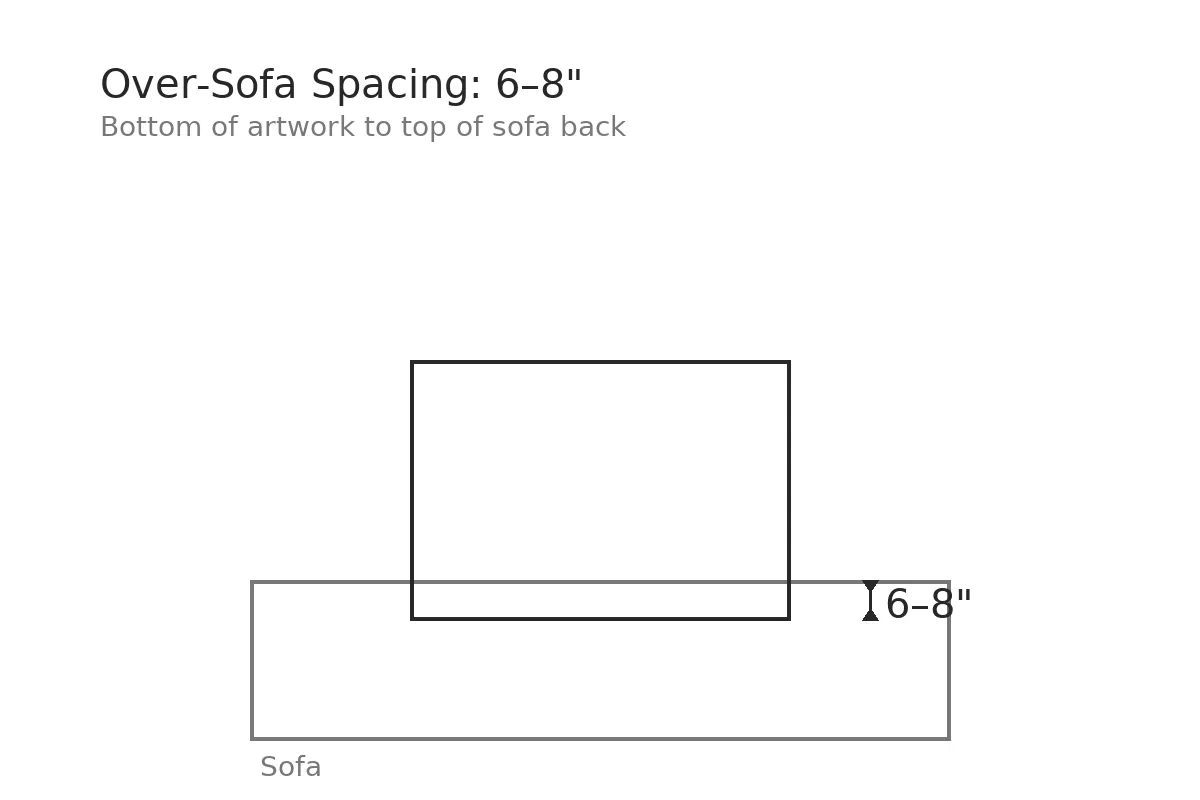
- Living room: Large single piece above sofa (bottom edge 6–8″ above), or a tight 2- or 3-piece set. Width target: ½–⅔ of sofa.
- Bedroom: Calm diptych above the headboard; keep tops aligned with a 57–60″ center if not over furniture.
- Hallway: Narrow frames 1–2″ apart to read as one ribbon.
- Dining: One big piece, hung slightly lower if the table is visually light so art and furniture “talk.”
Frames, Mats, and Finishes (Minimalist Defaults)
- Thin profiles in black, white, or natural oak.
- White or soft-white mats (or no mat for photographic edge-to-edge calm).
- Non-glare acrylic for bright rooms; standard glass for shaded walls.
These cues mirror mainstream minimalist design language—clean lines, limited ornament, neutral palettes—so the art feels native to the room.
Buying & Printing Basics (Quickly)
- Paper vs. canvas: Fine-art paper behind acrylic feels crisp; canvas is forgiving on big walls.
- Digital downloads: Look for 300 DPI or vector; print slightly larger than needed and trim for perfect margins.
- Plan the layout: Trace frames on kraft paper, tape the templates to the wall, and adjust before you make holes—the step-by-step is here.
- Hardware: Measure twice, use proper anchors, and mock up with painter’s tape first.
Mini Case Studies: Real Rooms, Measurable Impact
Case 1 — “Observatory of time & nature” (Essaouira, Morocco)
A newly published villa shows how a restrained shell + curated art collection can feel serene rather than sparse. Oversized single pieces anchor zones and natural textures (linen, wood, stone) keep the palette quiet while the art carries the interest. What to steal: pick one focal artwork per room; echo its material or tone once (frame, wood accent) so it reads intentional. See Wallpaper’s feature.
Case 2 — Soft-minimal workspaces (Nagano HQ)
Norm Architects treat art as part of a sensory palette—tone-on-tone frames and large negative space calm the eye, especially in circulation paths. What to steal: keep sightlines clean; choose art that harmonizes with the material story (oak, plaster, stone), not just the wall color. Explore Norm Architects’ Nagano HQ.
Case 3 — Sculptural minimalism on a lakeside
Here, architecture and art act as one composition—warm ash wood everywhere, crisp silhouettes, and curated views that behave like landscape art. What to steal: when architecture already has strong lines, pick quieter pieces with clear form (color-field, line work) so nothing competes. See Wallpaper’s Michigan lakeside house.
Designers, Artists & Trends to Watch (2025)
Warmer minimalism (goodbye “cold white”)
Minimalism in 2025 is softer and more character-filled—think neutral palettes with depth, tactile finishes, and fewer but better pieces. Read The Spruce on warm minimalism.
Quiet luxury—with color used sparingly
“Quiet luxury” evolves with richer palettes used discreetly (one large, impeccably framed piece; museum-grade materials). See Homes & Gardens’ color-forward take.
Japandi stays influential
The Japanese–Scandinavian fusion keeps leading: natural materials, calm geometry, handcrafted details—perfect with minimalist art. Overview via Vogue on Japandi.
Artist lens — Minimalist horizons now (Hiroshi Sugimoto)
A fresh museum program revisits Sugimoto’s “Seascapes,” proving horizon lines and negative space can be profoundly calming. See Parrish Art Museum’s exhibition page.
Tactile, woven surfaces as “quiet art”
Overscaled basketweave and woven reliefs are trending as low-relief wall statements—minimal yet tactile. See Livingetc’s basketweave brief.
Monochrome, done modern
Even seasonal styling is signaling a broader appetite for crisp black-and-white compositions. See Ideal Home’s monochrome highlight.
Mini FAQ
As a starting point, place the center at 57–60″. Over furniture, keep the bottom edge ~6–8″ above the piece so art and furniture read as one unit. See this room-by-room breakdown in Veranda’s hanging guide.
2–3″ between frames (1–2″ in tight spaces) keeps a grouping tidy and intentional—see Apartment Therapy’s three key measurements.
Aim for ½–⅔ of the furniture width so it feels anchored, not undersized—explained in Apartment Therapy’s 2/3 rule.
Reviewed By
Reviewed by Tina Delia, NCIDQ, Interior Designer — LinkedIn.