Table of Contents Show
A massive expanse of blank drywall intimidates many homeowners into rapid, unplanned decorating. The immediate reaction involves purchasing multiple oversized canvas prints or scattering dozens of small frames across every available surface. This approach transforms a calm residential room into a chaotic visual cluster. High-end interior design relies on strict architectural scale, mathematical proportion formulas, and deliberate negative space to showcase premium art pieces.
Professional decorators treat empty wall space as a structural asset, not a void requiring immediate camouflage. Hanging a single, heavy-textured canvas in a strategic location establishes room hierarchy and dictates the surrounding color palette. Filling every corner suffocates the architecture and forces individual pieces to compete for attention.
Selecting and positioning wall decor requires evaluating physical dimensions, calculating visual weight, mapping furniture boundaries, and manipulating ambient lighting. Executing these technical steps ensures your artwork grounds the room rather than overwhelming the floor plan.
Quick Verdict: Stop filling every blank wall. Choose wall art based on exact architectural scale and room hierarchy. Hang statement pieces at the museum-standard vertical center of 57 inches, span two-thirds the width of the anchoring furniture, and let secondary walls remain bare to prevent visual overcrowding.
Master the Mathematics of Architectural Scale
Eyeballing the size of a canvas inside a retail store leads to catastrophic scale errors once the piece arrives home. Retail showrooms feature 20-foot ceilings and massive square footage, shrinking the perceived size of a 40×60-inch painting. Inside a standard residential living room, that same piece dominates the vertical space.
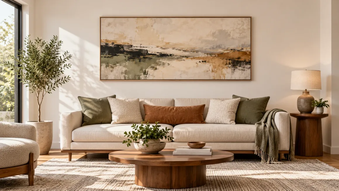
Anchor your wall decor to the furniture resting below it. A standalone canvas hung above a sofa, headboard, or dining credenza must span between 57% and 66% (roughly two-thirds) of the furniture’s total width. If your living room sofa measures 84 inches wide, your primary art piece needs a width of 48 to 55 inches. Hanging a tiny 24-inch print over a massive sectional makes the art look temporary and disconnected. To explore variations of this rule across different seating arrangements, review our breakdown of top wall art ideas for living rooms.
Maintain a strict vertical clearance. Leave exactly 6 to 8 inches of blank drywall between the bottom edge of the frame and the top edge of the furniture. Pushing the frame higher toward the ceiling breaks the visual connection, making the art appear as if it is floating away from the designated design zone.
Execute the 57-Inch Museum Hanging Standard
Homeowners consistently hang pictures too high. Vaulted ceilings trick the eye into pushing frames upward to fill the void. Professional curators at institutions like the Smithsonian use a non-negotiable metric: the vertical center of the artwork must sit exactly 57 to 60 inches from the floor. This measurement aligns with the average human eye level and keeps the piece engaged with the human-scale elements of the room.
Calculate this measurement using a simple formula before hammering a nail:
- Measure the total height of your frame and divide that number by two (this gives you the center point).
- Measure the distance from the top of the frame down to the tightened hanging wire.
- Subtract the wire drop distance from the center point.
- Add 57 inches to that final number.
Place your wall hook at this exact height. This formula guarantees the center of the image rests at 57 inches, regardless of frame size or ceiling height. Consistent center-line hanging unifies disparate art pieces across long hallways and open-concept floor plans.
Evaluate Visual Weight and Material Density
Tape measures dictate physical boundaries, but color depth and material composition dictate visual weight. Two frames sharing identical 30×40-inch dimensions exert entirely different pressures on a room.
A pale watercolor landscape framed in thin, raw ash wood carries minimal visual weight. It blends into the background and tolerates surrounding bookshelves, sconces, and busy wallpaper. Conversely, a dark, heavy oil painting framed in thick gilded molding absorbs ambient light and pulls the wall forward. Heavy pieces demand aggressive negative space around their borders.
Material density alters spatial perception. Flat canvas prints sit flush, while dimensional works like metal wall art introduce physical structure, depth, and harsh shadow lines under overhead lighting. Sculptural pieces function as secondary architectural features and require minimalist surroundings to prevent the room from feeling cluttered.
| Art Characteristic | Visual Weight Impact | Ideal Placement Strategy |
|---|---|---|
| Dark, Saturated Palettes | Heavy. Pulls the wall forward and absorbs ambient room light. | Center on wide, bright walls with minimum 12-inch blank borders. |
| Dimensional / Metal Art | Very Heavy. Casts shadows and introduces physical structure. | Display as a standalone piece over low-profile, neutral furniture. |
| Minimalist Line Art / Sketches | Light. Blends into the background without dominating the space. | Group into tight gallery walls or position in narrow hallways. |
| Thick Ornate Framing | Heavy. Acts as a distinct architectural element. | Allow generous negative space; avoid placing near heavy window treatments. |
Map the Room’s Structural Focal Point
Step through the main entrance of your room and track where your eye lands first. Rooms feature natural architectural focal points: a massive stone fireplace, a wall of floor-to-ceiling windows, or built-in library shelving. Art must respect this established hierarchy.
If your living room centers around a dramatic fireplace flanked by custom stonework, hanging a massive, high-contrast canvas on the opposite wall creates visual warfare. The brain struggles to determine where to look, causing the room to feel tense and disorganized. Support strong architectural features with quieter, tonal art pieces. Reserve bold statement canvases for rooms with plain, boxy architecture lacking distinct focal points.
Implement the Negative Space Principle
Empty drywall serves a critical structural purpose. Negative space provides visual resting zones between heavy design elements. Surrounding a premier canvas with smaller frames, floating shelves, trailing plants, and brass sconces suffocates the main piece and destroys its impact.
Provide generous borders around your primary art installations. Clear boundaries amplify the authority of the work. For homeowners struggling to brighten dark corners, discovering ways unique wall decor brightens a room involves removing clutter rather than adding more reflective objects. If removing a small side frame or decorative shelf makes the central painting look stronger, the wall did not need the extra items. High-end interior styling requires aggressive, unsentimental editing.
Build Color Relationships Using LRV and Pigments
Amateur decorators attempt to match art exactly to their sofa fabric or rug pattern. This rigid color-matching creates a flat, staged environment that looks like a budget furniture catalog. Professional designers build subtle color relationships using Light Reflectance Value (LRV) and secondary accent tones.
Instead of matching the primary background color of a painting to your walls, pull a minor tertiary pigment from the canvas and echo it through a small throw pillow, a ceramic vase, or a lamp base across the room. A painting featuring tiny flecks of burnt orange connects beautifully with a copper light fixture on the opposite ceiling. In neutral rooms dominated by beige, cream, or gray, inject highly expressive, saturated art to break the monochromatic fatigue.
Execute Gallery Walls with Structural Discipline
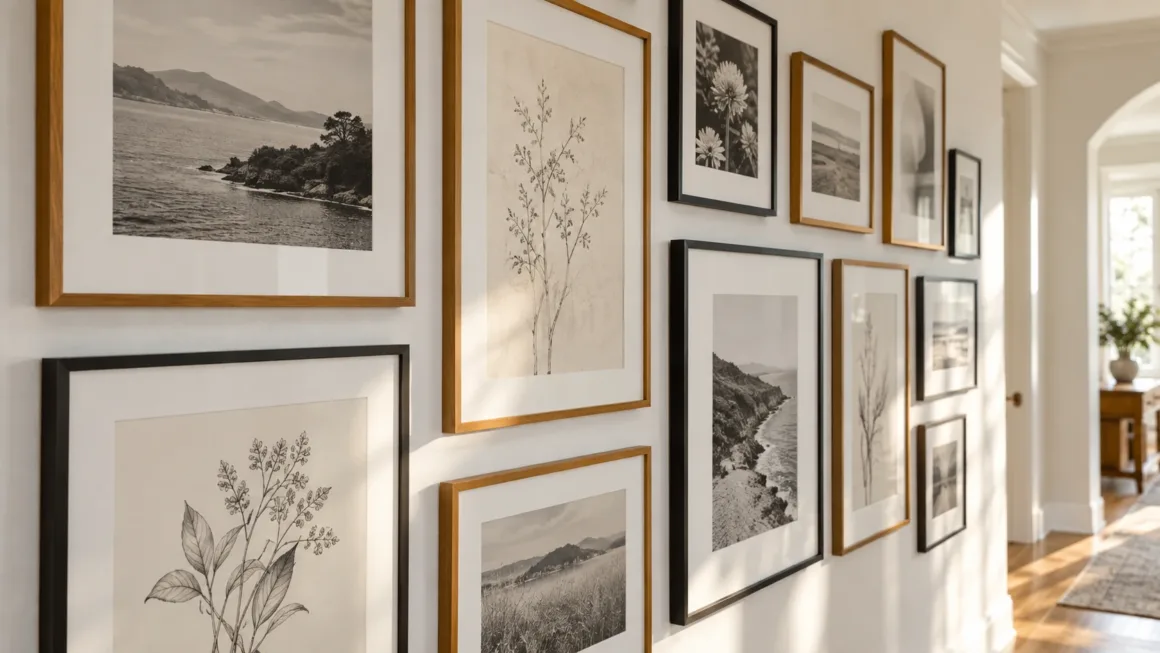
Gallery walls consolidate multiple small pieces into one massive visual block, but they quickly degenerate into chaotic clutter without strict structural discipline. Treat a gallery cluster as a single, unified architectural element.
Define the outer perimeter of the gallery before hanging the first frame. The outer edges of the collection should form a clean, recognizable shape (a square or rectangle). Maintain a strict, uniform gap of 2 to 3 inches between every frame, regardless of size. This consistent negative space provides the geometric skeleton that makes an eclectic mix of photographs, sketches, and oil paintings look intentional.
Never start hammering nails blindly. Trace your frames onto kraft paper, cut out the templates, and tape them to the wall using painter’s tape. Shift the paper templates until the balance of vertical and horizontal frames feels stable. Leave a minimum 12-inch boundary of empty drywall around the entire gallery block to prevent the collection from visually bleeding into adjacent doorways or windows.
Control Ambient Light and Surface Glare
Lighting dictates how art performs in a room. Standard residential lighting relies on 2700K warm bulbs, which cast a yellow hue that muddies cool blue and green pigments. To display art accurately, install 3000K LED bulbs with a Color Rendering Index (CRI) above 90 in your directional track lighting or picture lights. High CRI lighting reveals the true depth of the artist’s palette.
Protect framed pieces from harsh glare. Hanging art covered in standard glass opposite a south-facing window turns the piece into a blinding mirror during afternoon hours. Upgrade to museum-grade, anti-reflective acrylic (like Tru Vue) or reposition the art to an adjacent wall that receives indirect, grazing light.
Frequently Asked Questions
What is the correct height to hang wall art?
Hang artwork so the exact vertical center of the piece measures 57 to 60 inches from the floor. This museum-standard height aligns with average human eye level and visually connects the art to the furniture resting below it.
How wide should artwork be over a sofa or headboard?
Artwork should span between 57% and 66% (approximately two-thirds) of the total width of the furniture piece anchoring it. Leave a strict 6-to-8-inch vertical gap between the bottom edge of the frame and the top of the sofa back or bed frame.
Does every wall in a room need artwork?
No. Leaving secondary walls blank provides essential negative space. This empty drywall allows the eye to rest and amplifies the visual impact of your primary statement pieces without creating a cluttered, chaotic environment.
How much space should I leave between frames in a gallery wall?
Maintain a strict 2-to-3-inch gap between individual frames in any gallery wall grouping. Consistent spacing forms a structural grid, making a collection of different-sized frames look like a single, cohesive architectural unit.
Author & Editorial Review
Author: Perla Irish serves as Content Manager at DreamlandsDesign. Drawing on experience in residential layout planning and interior styling, she helps homeowners navigate spatial design, material scale, and architectural proportions.
Editorial Review: This guide was reviewed by the DreamlandsDesign editorial team for design accuracy, scale proportions, and practical application. All recommendations align with established interior styling principles and museum-grade hanging standards.